
It’s so fun to see the color forecasts each year from our paint partners. This year, the trends are about relaxing, comfort, serenity, and nature. Take a look at these color forecasts for some inspiration and ideas for your next project.


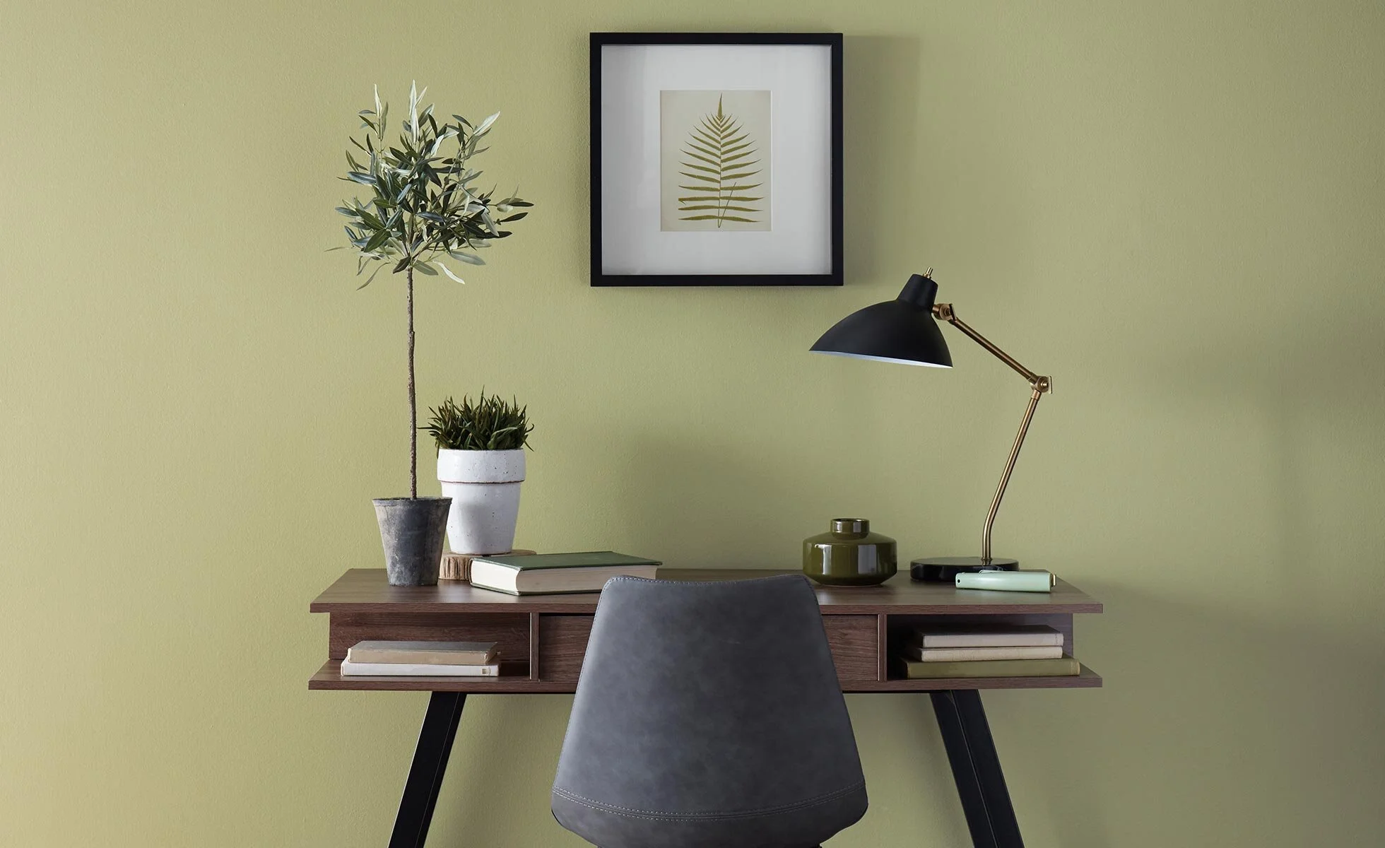
Sherwin-Williams announced its 2021 Color of the Year: Urbane Bronze SW 7048. A warm, sophisticated bronze, the color inspires all of us to find sanctuary in any space. Urbane Bronze is a rich anchor that grounds the mind in calm and stability with its ties to the natural world.
“The home is now the ultimate retreat from the world, and color is an easy and effective way to create a personal haven,” said Sue Wadden, director of color marketing at Sherwin-Williams. “Urbane Bronze encourages you to create a sanctuary space for mindful reflection and renewal.”
Now more than ever, our homes have become the backdrop to our lives, reminding us that the moments worth cherishing have always been right in front of us. As we're looking to create the ultimate retreat for reflection and renewal, we're turning to a hue whose natural simplicity and nature-inspired energy cultivate a sense of calm from the ground up.

Photo from Benjamin Moore: Aegean Teal
Benjamin Moore has revealed its Color of the Year 2021 as Aegean Teal 2136-40 – an intriguing blue-green that creates natural harmony and invites us to reflect and reset. Rooted in the elegant, handspun textures of the home, the Color Trends 2021 palette comforts as it uplifts.
In an intimate look at the home, Color Trends 2021 begins in the kitchen, exploring how this intersection of craft, nourishment and community breathes color and design inspiration into the rest of the living space. The Color Trends 2021 palette and the Color of the Year reflect this grounded sensibility with warm, sunbaked hues that play to the senses.
“Amid uncertainty, people yearn for stability. The colors we surround ourselves with can have a powerful impact on our emotions and wellbeing,” said Andrea Magno, Benjamin Moore Director of Color Marketing & Development. “Aegean Teal 2136-40 and the corresponding Color Trends 2021 palette express a welcoming, lived-in quality that celebrates the connections and real moments that take place within the home.”
For 2021, BEHR chose a color palette of 21 unique hues divided into six color themes, but they can all work together. “A new, ‘elevated’ articulation of ‘comfort’ goes beyond traditional beige, gray and green hues, and embraces color in a way that can redefine and enhance any type of space inside or outside the home.”

Photo from BEHR
CASUAL COMFORT - These light warm neutrals and whites create an inviting feeling in entryways, kitchens and open living spaces.
CALM ZONE - Soothing blues and greens create a restorative escape offering ease and solace.
SUBTLE FOCUS - Light hues feel sophisticated and inviting, creating and atmosphere that is effortlessly serene.
QUIET HAVEN - Deep hues have a reassuringly sublime and dependable nature, delivering the effect of a peaceful oasis in your home.
OPTIMISTIC VIEW - A pop of bright color lifts the mood in any space, making it great for kitchens, playrooms and anywhere you want to feel energized.
OUTDOOR ESCAPE - Curbside appeal has never been easier with exterior house colors and eye-catching accents for front doors, shutters and furniture pieces for outdoor living.
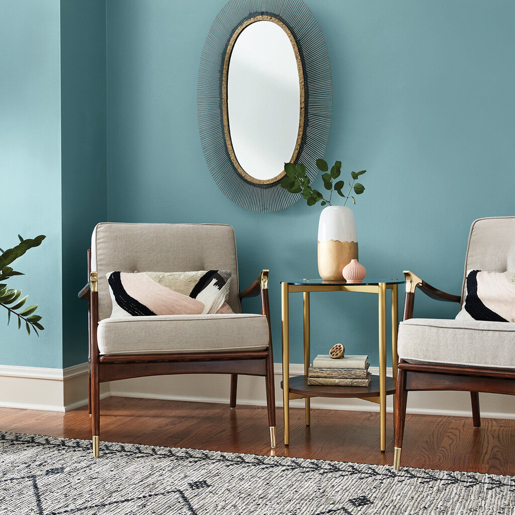
Photo from Valspar: Garden Flower
Valspar 2021 Colors of the Year
Industry leading paint and coatings brand, Valspar, announced its 2021 Colors of the Year with 12 livable shades that evoke calm, serenity and simplicity. With this palette, Valspar seeks to empower consumers to take control of their environments and create spaces that will expand their worlds, calm their minds and enrich their lives. ″Our homes have become offices, entertainment centers, and classrooms, which means the colors, sights, and sounds in our rooms have an even bigger impact on our daily lives,″ said Valspar color marketing manager Sue Kim in a press release. As more stress and time at home in 2020 coincided with a surge in DIY projects and an increased interest in meditation, this year's selection aims to ″turn home improvement into self-improvement."

Photo from Valspar: Granite Dust
Valspar has curated these 12 Colors of the Year to include a range of shades that provide flexibility and can be incorporated into existing design elements of the home. The list of Valspar 2021 colors features neutrals, including Gallery Grey, Granite Dust, Maple Leaf, Soft Candlelight, and Unforgettable.
Organic colors, such as Arizona Dust, Cherry Taupe, and Dusty Lavender, and cooler colors like Academy Gray, Blissful Blue, Garden Flower, and Lucy Blue.
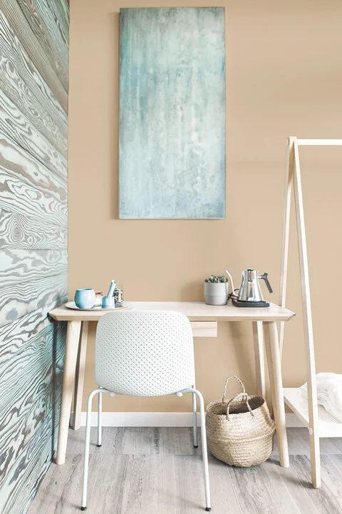
Photo from PPG
PPG 2021 Paint Color Palette Of The Year
In an era where normal is no longer and mental and physical well-being have become more important than ever, consumers are craving simple comforts and a slowed-down lifestyle. Emulating both the optimism felt in nature and soothing nostalgia, the PPG 2021 Palette of the Year “Be Well” consisting of hues Transcend, Big Cypress and Misty Aqua. “With the world sheltering in place for the better half of the year, we have begun to crave human connection and embrace simple activities, including walking, hiking, baking and gardening,” said Dee Schlotter, PPG senior color marketing manager, architectural and industrial coatings. “This organic and hopeful palette represents what we have been longing for after decades of overstimulation and overconsumption – simplicity and restfulness.”